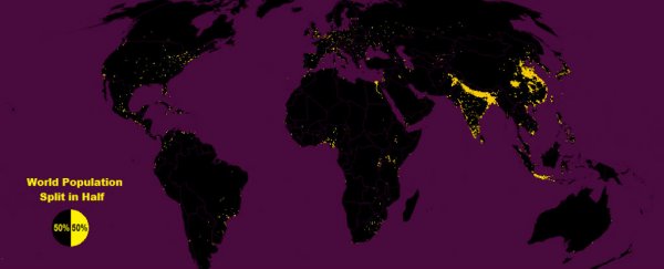
Right now, half the world's 7.3 billion people are living in the scattered yellow regions marked on the map above, by New York-based data cruncher Max Galka, while the rest are spread across that vast expense of black.
Using gridded population data published by NASA, which records the global population in each 14-square-km patch of Earth, Galka's map visualises how half of us have crammed ourselves into 1 percent of the world's land space (yellow), and the other half is living in the remaining 99 percent (black).
As Galka notes over at Metrocosm, while population is usually broken down by geographic regions, such as countries, states, and cities, gridded population data splits the the global population into a sprawling grid of tiny, evenly-sized squares, where administrative borders become irrelevant.
The map above is based on a population grid of 28 million cells, each one measuring roughly 3 miles x 3 miles (4.8 km x 4.8 km). Galka explains:
- "The yellow region in the map includes every cell with a population of 8,000 or more people. Since each of them has an area of about 9 square miles (14 square km), the population density of each yellow cell is at least 900 people per square mile (1.6 km), roughly the same population density as the state of Massachusetts.
- Conversely, the black region is made up of those cells with populations of less than 8,000 people. In other terms, the population density throughout the black area is less than 900 people per square mile."
For a better look, you can download a high resolution version here.
You can see that most of the yellow region is located in India, Bangladesh, and China, where nearly half (46 percent) of the world's population is located. Below that is the bright yellow island of Java in Indonesia, which is about the same size as New York State, but contains a population of 140 million, making it the most populous island in the world.
Japan, which you can see as a fainter yellow region nearby, is the second most populous island in the world, fitting 37 million people into Tokyo - the world's most populous city.
But none of these regions contain the single most populated cell in the entire map. "In all the world, the cell with the largest population is located in Cairo," says Galka. "The area, which measures only 9 square miles (14.4 square km), is home to over a million people."
Interestingly, by visualising population data in this way, the map shows how the US population actually mirrors the way the global population is divided, as Galka notes on his website:
"Coincidentally, the same yellow-black regions that split the world population evenly in half also happen to split the U.S. population evenly in half as well. As with the world population, roughly half the US population lives in the yellow, and half lives in the black."
The message? If the global population really is going to hit 11 billion by 2100 as predicted - with the most growth expected to occur in Africa - we can't say we don't have enough room for everyone. But with the best and most liveable regions already well and truly taken up, spreading out is not going to be easy - not by a long shot. Maybe that's what Mars is for.
