We just can't resist a good optical illusion. It's simultaneously grounding and deeply disorienting to feel that our perception of the world around us can lie so dramatically. But it's also just fun to trick our own brains.
When we think about optical illusions, we're usually thinking of a subset of illusions called cognitive illusions. These are illusions that - unlike a mirage, for instance - interact with our unconscious assumptions about the world and our perceptual processing.
This leads to "unconscious interferences" where our brain's tendency to predict what we're seeing fills in the gaps. We can use this process to "trick" ourselves by viewing images that our brains misinterpret based on the way they process visual data.
Here are some of these illusions that sent the internet into a frenzy - and the science behind them.
1. The f*#king dress
For a few days in February 2015, all anyone could talk about was The Dress. For all three of you who were asleep for those few days, it was a seemingly mundane picture of a dress posted to Tumblr.
But something curious happened - people couldn't agree on what colour the dress was.
Some people saw it as striped black and blue. Others saw it as striped white and gold. It all started to look like this - until science saved the day (of course).
The dress is black and blue. But there's a bright light behind it - and because your brain knows that sunlight can interfere with light reflecting off an object, it will correct for that interference, subtracting those wavelengths from the actual object.
Because the light is so bright, our brains assume it's sunlight - which is why so many of us see the dress as white and gold.
2. The non-red strawberries
This picture has NO red pixels. Great demo of color constancy (ht Akiyoshi Kitaoka) pic.twitter.com/pZHvbB6QHE
— Matt Lieberman🇺🇦 (@social_brains) February 27, 2017
There's a similar correction at play with this picture of strawberries. "What's so strange about that picture of strawberries, apart from the teal filter" you might think.
Well, there's not a single red pixel in it.
"But it looks red!" you say. That's your brain, going around correcting colours again. In this case, it's not because of the lighting - it's because your brain knows strawberries are red, so it fills in that particular detail for you.
This phenomenon - like the dress - is called "colour constancy," and it's a feature of colour perception that makes sure that the perceived colour of objects remains the same under different lighting conditions.
If you need some proof on the strawberries, poke a hole in a piece of paper and position the hole over one of the "red" parts. Not so red now, is it?
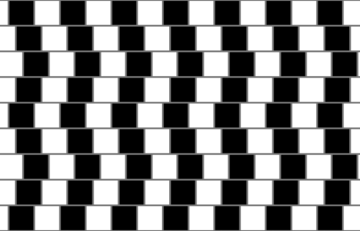
This one probably makes your eyes feel a bit funny. It was named after a cafe wall in Bristol in the UK, with offset alternating dark and light tiles, and thin lines of grout in between the rows, of a grey shade.
It looks like the rows are tilted, with alternating lines tilted in opposite directions - but they're actually perfectly parallel. So what's going on cognitively with this one? Uh, we don't know.
But if you play around with this interactive tool, setting the "grout" lines to 0 pixels, you'll see that without those lines, it doesn't work. If you stop the tool and take a careful look at those lines, you'll also notice that the contrast between the tile and the line seems to change depending on whether it's between two dark tiles, two light tiles, or a dark tile and a light tile.
According to a 2005 paper, the reason seems to have something to do with interactions between the neurons in the visual cortex that code for orientation, but without further research, well, shrug emoji.
4. Curvature blindness illusion
 (Kohske Takahashi/i-Perception)
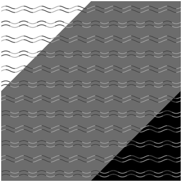
Most people, looking at the grey-background section of the above image, will see sets of parallel lines, alternating between gently wavy and jagged zig-zags. But - they're all wavy. Every last one of them.
This is called curvature blindness, and it requires a very specific set of conditions. If you look at the corners with the white background and the black background, you'll see that all the lines appear wavy.
If you look more closely at the zig-zag lines in the grey section, you'll see that the dark and light sections fall neatly exactly between the peaks and troughs, while the wavy lines have darker and lighter sections directly over the peaks and troughs.
The designer of the illusion, Kohske Takahashi, isn't sure what's going on, but believes it could have something to do with how our eyes differentiate curves and corners.
5. The brick road
These two pictures are identical.
This was a great bafflement to the internet earlier this year, but it actually has some precedent - something called the Leaning Tower Illusion, featuring two identical photos of the Leaning Tower of Pisa.
According to the creators of that illusion, it's likely because we perceive the two images as one whole scene. If we were standing in front of it looking at it directly, the street on the left would be turning more to the right.
This happens because we possess depth perception and an instinctive understanding of perspective - our brains automatically "correct" the angle as if we were looking at a single scene in three dimensions.
6. The spinning dancer
Before there was even such a concept as "going viral," there was the spinning dancer - an optical illusion that made its way around the internet via email rather than social media, often as a "test" to determine which side of your brain you use most. Spoiler, it can't determine that. But the illusion is still a fun one.
Is she spinning clockwise or anti-clockwise? Or maybe while you're trying to figure it out, she switches, and appears to start spinning the other way?
Well, neither. Or both. Created by web designer Nobuyuki Kayahara in 2003, the spinning dancer is an example of what we call an ambiguous image. Because there are no cues to indicate depth, our brains just sort of fill those bits in. Most people see her turning clockwise.
The dancer is an example of a phenomenon called multistable perception - or bistable, in this case. When an image is too ambiguous for one interpretation, the brain will sometimes perceive multiple interpretations - although never simultaneously. So you can see the dancer turning clockwise or anti-clockwise, but never both at once.
You can check out more bistable illusions on this page here.
7. The dancing black dots
There are twelve black dots at the intersections in this image. Your brain won’t let you see them all at once. pic.twitter.com/ig6P980LOT
— Will Kerslake (@wkerslake) September 11, 2016
There are 12 black dots in the grid above, called the Scintillating Grid Illusion, but you're not going to be able to see all of them at once. You can try. Go ahead, we'll wait.
Did you manage it? Yeah, we didn't either. But it's because your brain is doing its job, using something called 'lateral inhibition' - when a neuron in your brain becomes excited, it dims the activity of the neurons around it. This allows the excited neuron to respond more strongly than if all the neurons were active.
This increases sharpness and contrast in the visual response, which is actually a pretty useful thing to have.
8. The ambiguous cylinder illusion
OK, what is even happening right now. Those are clearly square-shaped tubes, but when viewed in the mirror, they turn into circles. Welcome to the ambiguous cylinder illusion.
The trick lies in the shape of the tubes - neither entirely circular nor square, but a shape somewhere between the two, with convex and concave shapes at the top of the tube.
This insanity was created by engineer Kokichi Sugihara from Meiji University in Japan, who explained:
"The direct views of the objects and their mirror images generate quite different interpretations of the 3D shapes. … We cannot correct our interpretations, although we logically know that they come from the same objects. Even if the object is rotated in front of a viewer, it is difficult to understand the true shape of the object, and thus the illusion does not disappear."
Just explaining how it works probably isn't really going to cut it. Luckily, there's a video that lays it out here.
9. The coffer illusion
 (Andy Norcia)
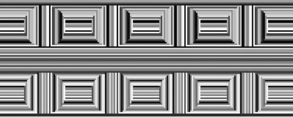
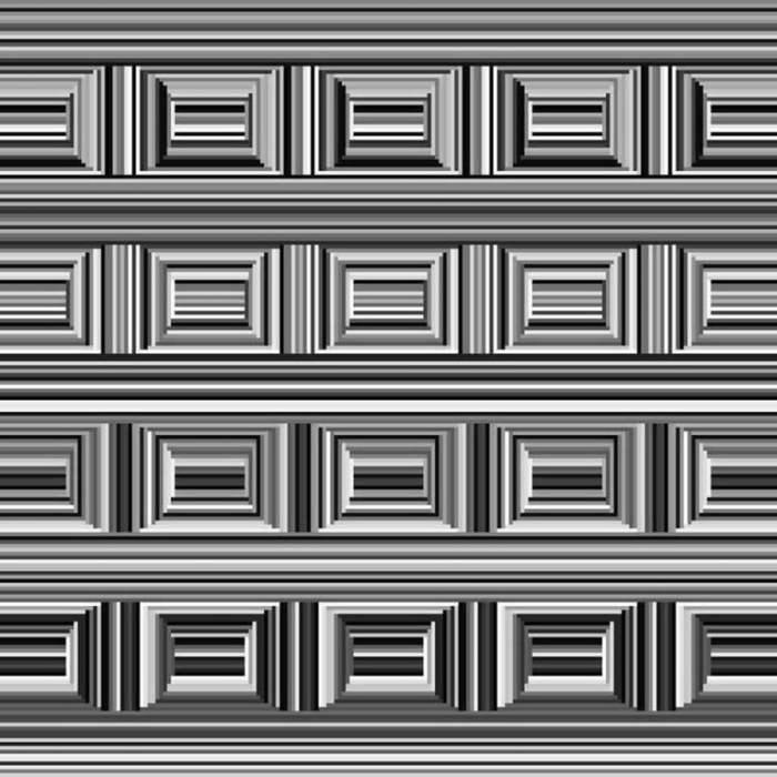
This image actually contains 16 circles, but most people can't see them at first. Look closer. Still can't see them? Try looking between the rectangles. If you still can't see it, there's a handy guide here, but once you've seen the solution, you'll never unsee it.
This is called the Coffer Illusion, and it was submitted by Andy Norcia, formerly of the Smith-Kettlewell Eye Research Institute now at Stanford University, to the 2006 Best Illusion of the Year Contest.
Like the spinning dancer, it's an ambiguous image, where two interpretations are possible - but for some reason, most people interpret it first as rectangles.
Why would the rectangles be dominant? Nobody's sure, but as psychologists Kim Ransley and Alex Holcombe explained, "This may be because rectangles (including the ones we see in door panels) are often more common than circles in our daily environment, and so the brain favours the grouping that delivers rectangular shapes."
10. The Troxler effect
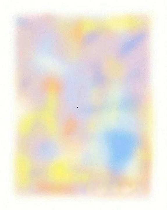 (Reddit/NightBreeze13)
Now you see it - now you don't. If you unfocus your eyes and direct your gaze at the black dot in the middle of this image, you'll probably notice that, after a few seconds, the colours begin to disappear, one by one.
It's called the Troxler effect, or Troxler flading - named for physician Ignaz Paul Vital Troxler, who discovered in 1804 that if he focussed his eyes on a fixed spot, the surrounding image would gradually disappear from view.
We have a more detailed explanation here, but the basic thrust is: if you focus on one tiny point, and the rest of the scene doesn't move, your eyes sort of become desensitised to it, and fade it into the background.
So now you know something about the way your brain can lie to you about the information right in front of your eyes. We think there's a life lesson somewhere in there for all of us.
