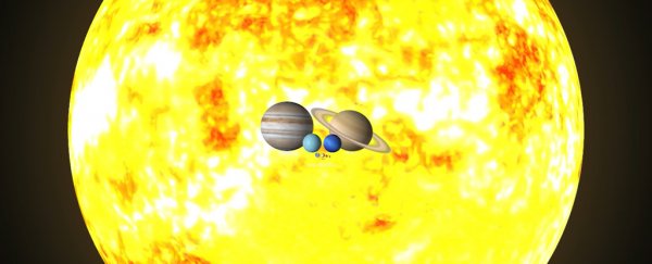
Sometimes it takes an animation on Twitter to truly comprehend – or at least begin to comprehend – the amazing diversity of worlds making up our Solar System.
Enter planetary astronomer James O'Donoghue from the Japan Aerospace Exploration Agency (JAXA). He tweeted out a brief animation that starts off with the Ceres dwarf planet, and moves up through Solar System objects by size (including Earth), before closing by zooming out to take in the Sun.
There's a slightly higher-quality version of the same clip over at YouTube.
Even if you know the relative size of everything in the Solar System, it's still quite a moment when Jupiter and the Sun swing into view – and you might never have realized quite how fast Jupiter spins relative to Earth either.
We'd recommend setting aside a bit of time to watch these spinning orbs. The video clip is only 45 seconds long, but it's mesmerizing enough that you're going to be watching it several times over – as we write this it's been viewed some 8 million times.
The sizes, tilts, and rotations are all to scale in this clip, though of course the positioning has been changed – all of the planets and stars you see have been pushed closer together so they'll fit inside the same video clip.
If you want to know some of the numbers behind the animation, our own planet is 12,742 kilometers or 7,918 miles wide. Jupiter, in contrast, has a diameter of 139,820 kilometers or 86,880 miles – that's more than 10 times larger in diameter.
The diameter of the Sun is around 1.39 million kilometers (863,706 miles), so that's around 10 times bigger in terms of distance than Jupiter, and more than 100 times bigger than Earth. To put it another way, about a million Earths could fit into the Sun.
James O'Donoghue has previous form for this too – he's put together plenty of other videos showing the jaw-dropping scale of the Solar System, and we're very grateful to have them.
